Every morning, we run The Narrative Machine on the past 24 hours worth of financial media to find the most on-narrative (i.e. interconnected and central) stories in financial media. It’s not a list of best articles or articles we think are most interesting … often far from it.
But for whatever reason these are articles that are representative of some sort of chord that has been struck in Narrative-world.
April 17, 2019 Narrative Map – US Equities

JPMorgan Chase’s Numbers Belie Recession Coming [Forbes]

If you liked this, you’ll love the Marty’s 1975 financial markets classic…
<checks notes>
AdvisorShares Launches Pure Cannabis ETF (Ticker: YOLO) [Press Release]

Wonderful.
And yes, we had one of these yesterday, too. Cannabis articles punch way above their weight in narrative land. But whereas yesterday’s fund from Horizon went with a firm format ticker (HMUS should be a Near-East Staples Sector ETF), AdvisorShares went for the gusto with this one (pun withheld).
I previously favored Cambria’s registration of TOKE, but YOLO has just the right 2012 vibe to really make it sing for me.
And as Ben wrote yesterday, why the string of thematic ETFs? Because fees.
Veteran SPAC Sponsors Roll Out Fifth Vehicle [Deal Pipeline]
I actually don’t have a link to this article. The Deal routinely makes its full text available to LexisNexis Newsdesk, but doesn’t have a public-facing Google-searchable link for this one.
What I will do is show you the Quid network map of SPAC articles since the start of our news dataset in August 2013. A disconnected mess. In general, financial media don’t understand, don’t care, and don’t write about these things, except to dutifully cover the IPO if it has a noteworthy person attached.
I can think of several reasons why SPACs would contain language that connected them broadly to the Zeitgeist, and none of those reasons are especially good.

A Deep Dive Into Chevron’s Fundamentals For Dividend Investors [Seeking Alpha]
One of the things that manifests clearly in the similarities between financial media articles over time, whether it’s professional publishers or Seeking Alpha contributions like this, is a pronounced orientation toward dividend and yield investing. Not only are they very common – broad media seeks an expansive retail base, after all – but extremely cohesive. Clusters of articles about dividend and dividend growth investing are almost always among the most internally consistent.
People know how to sell yield, and the ways that have always worked continue to work.
LACERA launches factor-based, bank loan searches totaling nearly $5 billion [P&I]

I don’t want to fall prey to Gell-Mann Amnesia here – I’ve been on the wrong end of inaccurate, misleading or incomplete coverage of public pension decisions before. With all that in mind, I will admit that this seems odd.
If I’ve learned anything over the years, it is that slow maybes are nearly always the worst way to make investment decisions. I know why, in my experience, someone would suggest a ‘paper portfolio’ trial period. Maybe the manager was small or new and an investment committee or Board member wanted to see more ‘live’ evidence before pulling the trigger. Maybe someone was on the fence and just needed a little more data to move them. I don’t know this firm, although the people are all FX Concepts alums, and anyone who hired hedge funds in the 90s or early aughts knew them. They were the kings of overlay, until, well, they weren’t.
But I can’t conceive of a world in which 6 months of data on the performance of a paper cash overlay strategy could do anything but deliver false comfort or false fear. A 6-month paper portfolio period is a process which institutionalizes randomness. Still, I don’t have all the details, and if there’s anything to be learned from our awareness of Fiat News, it’s that we very often are not getting all the relevant information. Maybe there’s a more sensible explanation.
US Congressional Divide [Business Insider]
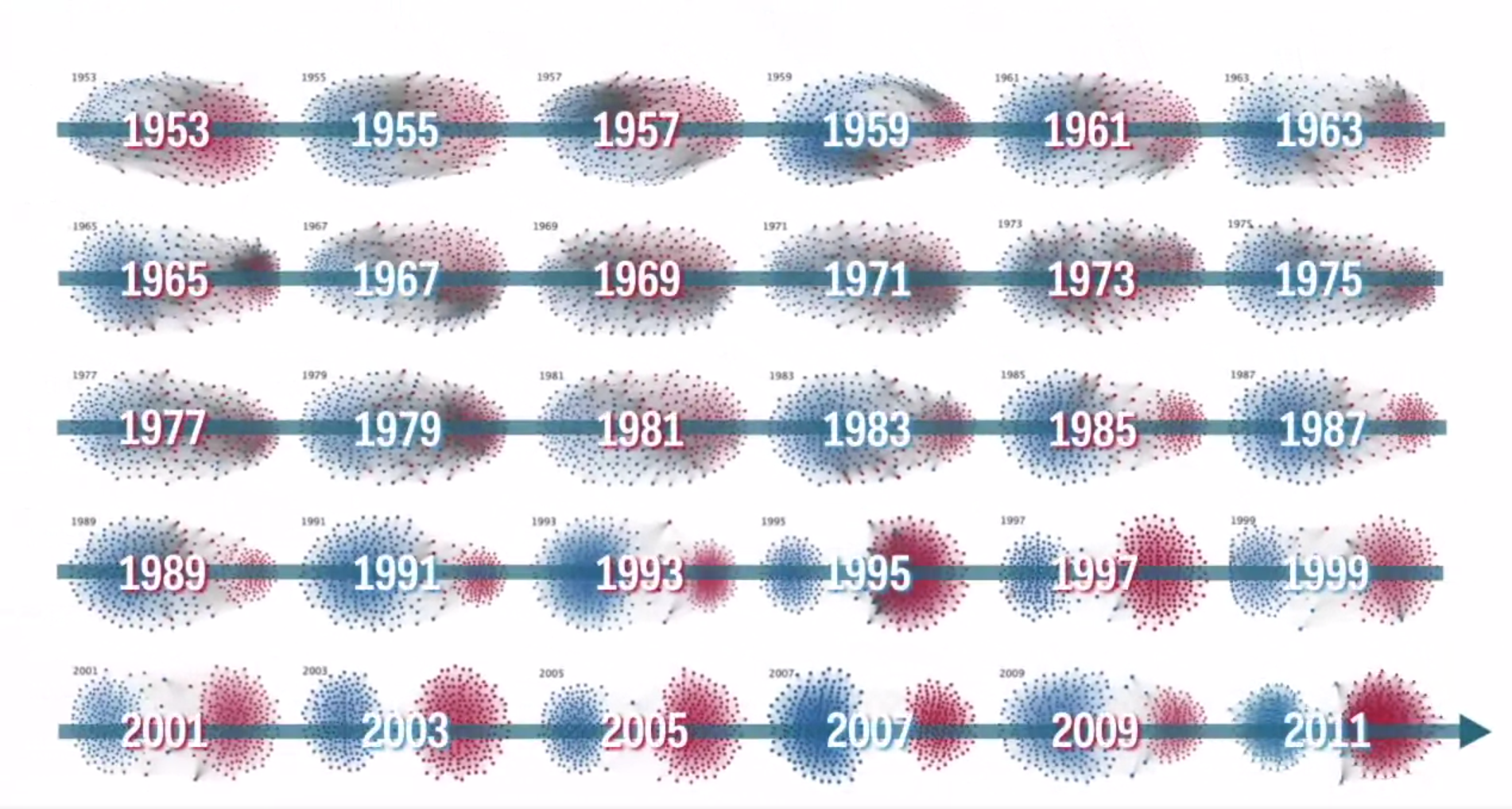
This one didn’t come through the Quid analysis, but was brought to our attention by subscriber Matthew M. It’s a Mauro Martino visualization – very similar to the calculation and display methodology of our Quid network maps – of voting patterns in the US Congress.
The Widening Gyre.


That congressional visualization is very interesting. It shows that the gyre split during the Reagan years, and since then it’s just been calcifying. The grey dots are a major part of most congresses prior to 1981, and after 1987 they’re just an occasional presence.